Warwick Johnson Cadwell
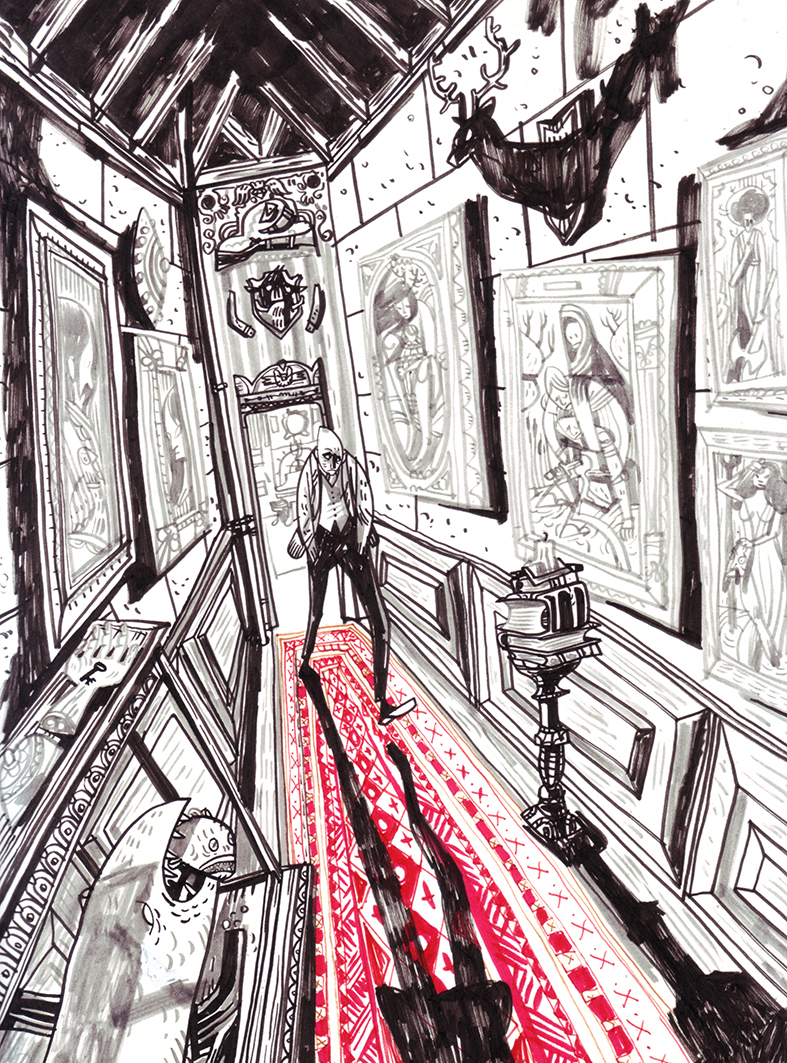
I like Cadwell’s confident inking, with bold blocks of black creating a strong contrast in tone.
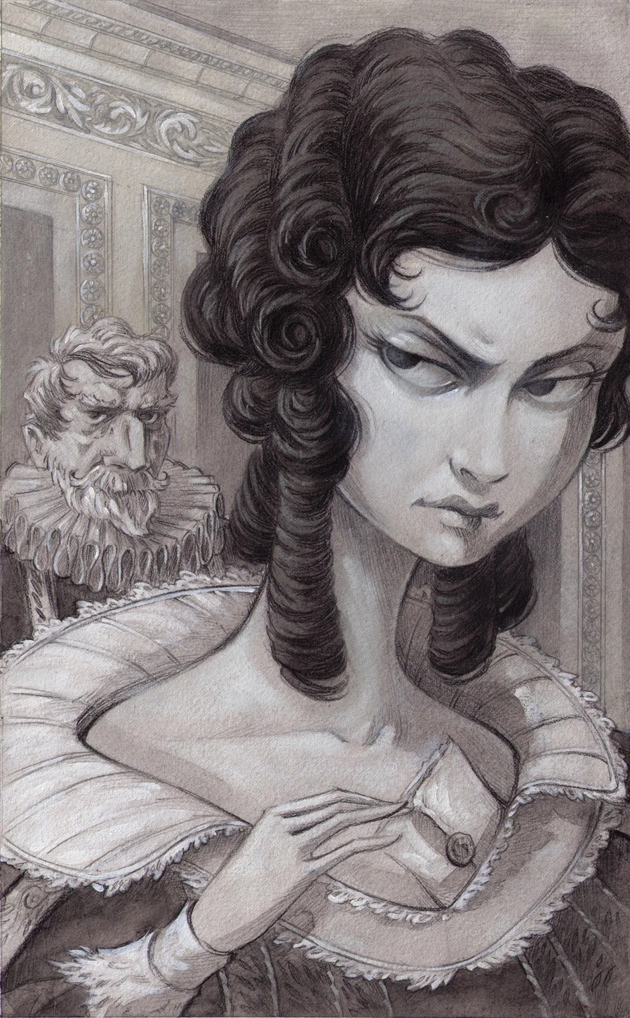
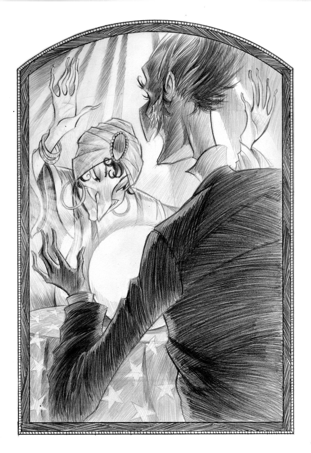
I like his greyscale work best; it sets a dark tone and feels more visually striking. I love the use of bright red in the second illustration, and how it creates a focal point that demands attention.

Thumbnails & character design


Colour experimentation
My role in this group project was thumbnailing and colour. I wasn’t sure which direction to take the colour of the comic, so I made these quick tests to take back to my partner. Ultimately, we liked grayscale with a splash of colour best.


- Brooke, D. (2022) Warwick Johnson-Cadwell on the head-popping and horrors in ‘Falconspeare’, AIPT. Available at: https://aiptcomics.com/2022/01/13/falconspeare-vampire-tale-qa (Accessed: 16 September 2025). ↩︎
- Decie, J. (2022) ‘I Much Prefer The Drawing Of A Thing More Than The Finishing Of It’: An Interview with Warwick Johnson Cadwell – The Comics Journal, The Comics Journal. Available at: https://www.tcj.com/i-much-prefer-the-drawing-of-a-thing-more-than-the-finishing-of-it-an-interview-with-warwick-johnson-cadwell (Accessed: 16 September 2025). ↩︎
- Helquist, B. (2019a) The Carniverous Carnival, BRETT HELQUIST ILLUSTRATION. Available at: https://bretthelquistillustration.com/the-carniverous-carnival (Accessed: 16 September 2025). ↩︎
- Helquist, B. (2019b) The Three Musketeers, BRETT HELQUIST ILLUSTRATION. Available at: https://bretthelquistillustration.com/the-three-musketeers (Accessed: 16 September 2025). ↩︎