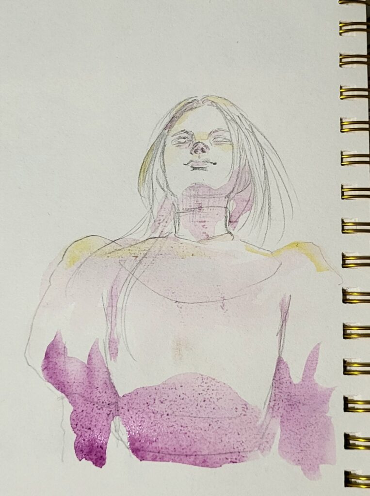
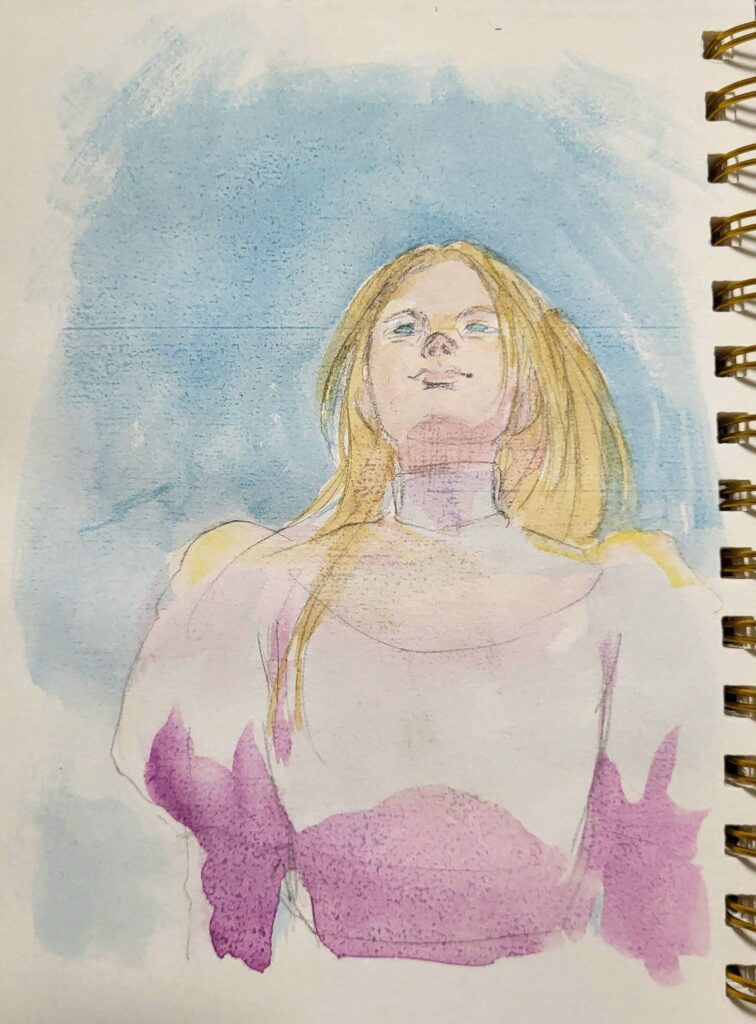
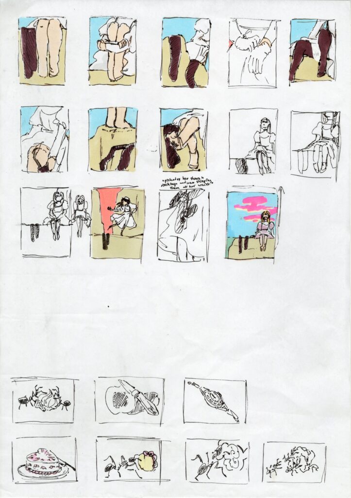
Thumbnail Development
I selected some of my more successful ideas to develop further, experimenting with composition, horizon lines, emotion. I wasn’t particularly excited by any of my vignette ideas so I came up with more ideas. I liked the image of sugar ants carrying icing from the picnic so I developed that idea further. The book frames the girls as unaware of the insects and dangerous wildlife that surround them, always lurking just out of sight. I liked the idea of showing the reader these creatures, building tension and fear for the girls’ safety.

Feedback:
We agreed that the composition of the cover works well, however I was cautioned away from using a snake, as it holds connotations of the Garden of Eden. The snake’s presence also made it feel like the girls were being chased or attacked by it- which is not in line with the book.
For my other illustrations, it was suggested that I focus more on the lush environment and experiment with compositions that aren’t close-cropped.


Snakes, lizards, and ants are the most common animals mentioned in the novel. I tried replacing the snake in my earlier composition with a lizard. The species of lizards native to the rock that I was able to find in my research were mostly dull shades of brown, so I considered using a less realistic colour and taking more inspiration from their markings. I struggled to represent the lizard in the same flat style as the snake, as inspired by Aboriginal paintings, but I’m happy with the design I developed.
Media Development